UK Climate Change
Preamble
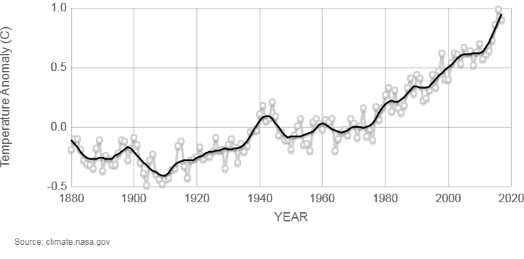 I found this on NASA’s climate site and my curiosity was piqued.
Temperature anomaly, how did they get to that?
Anomaly versus what?
Surely, it’s against where the temperature should be, but how do you know where the temperature should be?
What effects do you account for and what do you leave out?
I thought I’d have a stab at how they came up with these numbers, but I wanted to do it for UK data, specifically. We often hear about global numbers for climate change but what has the change been here in the UK, or in specific areas of the UK?
Data Source
For those in the business of nerding it up and looking into stuff like this, you might be interested to take a look at data.gov. This site is a great resource for official UK government data, spanning across all sectors.
The most popular dataset, under the environment theme, on data.gov was the Historical Monthly Data for Meteorological Stations set.
Billed as having observations for most stations back to 1900 and some back to 1853, this sounded perfect for what we want to do here.
The government site links out to the Met Office, who hosts the data as text files.
So, I scraped all the URLs for the data files, one for each of the thirty seven weather stations and got started in R-Studio.
The data is in what appears to be a fixed width format .txt file, with a verbose header.
Let’s take a look at the first 20 lines of the file for one of the weather stations, to get an idea of what we are up against.
Here I chose Oxford’s, just because it has the most observations.
##  [1] "Oxford"
##  [2] "Location: 450900E 207200N, Lat 51.761 Lon -1.262, 63 metres amsl"
##  [3] "Estimated data is marked with a * after the value."
##  [4] "Missing data (more than 2 days missing in month) is marked by  ---."
##  [5] "Sunshine data taken from an automatic Kipp & Zonen sensor marked with a #, otherwise sunshine data taken from a Campbell Stokes recorder."
##  [6] "   yyyy  mm   tmax    tmin      af    rain     sun"
##  [7] "              degC    degC    days      mm   hours"
##  [8] "   1853   1    8.4     2.7       4    62.8     ---"
##  [9] "   1853   2    3.2    -1.8      19    29.3     ---"
## [10] "   1853   3    7.7    -0.6      20    25.9     ---"
## [11] "   1853   4   12.6     4.5       0    60.1     ---"
## [12] "   1853   5   16.8     6.1       0    59.5     ---"
Import
We have coordinates for the station in the meta data, that is definitely worth pulling out so we can see how this data varies spatially.
The data starts after the units’ row [7], under the variable names [6].
Some of the other files might have extra details in the header, so it’d be a good idea to account for that and not just assume the data always starts on [8].
Let’s try and pull the important bits out of these files in a repeatable way that gives us something more accessible.
| Location | Lat (deg) | Lon (deg) | Month | Year | Maximum Temperature (degC) | Minimum Temperature (degC) | Temperature Range (degC) | Days of Air Frost | Total Rain Fall (mm) | Sunshine Duration (hours) |
|---|---|---|---|---|---|---|---|---|---|---|
| Oxford | 51.761 | -1.262 | January | 1853 | 8.4 | 2.7 | 5.7 | 4 | 62.8 | NA |
| Oxford | 51.761 | -1.262 | February | 1853 | 3.2 | -1.8 | 5.0 | 19 | 29.3 | NA |
| Oxford | 51.761 | -1.262 | March | 1853 | 7.7 | -0.6 | 8.3 | 20 | 25.9 | NA |
| Oxford | 51.761 | -1.262 | April | 1853 | 12.6 | 4.5 | 8.1 | 0 | 60.1 | NA |
| Oxford | 51.761 | -1.262 | May | 1853 | 16.8 | 6.1 | 10.7 | 0 | 59.5 | NA |
This follows the usual old trope, each variable forms a column, each observation forms a row and can be repeated for each weather station.
Exploration & Modelling
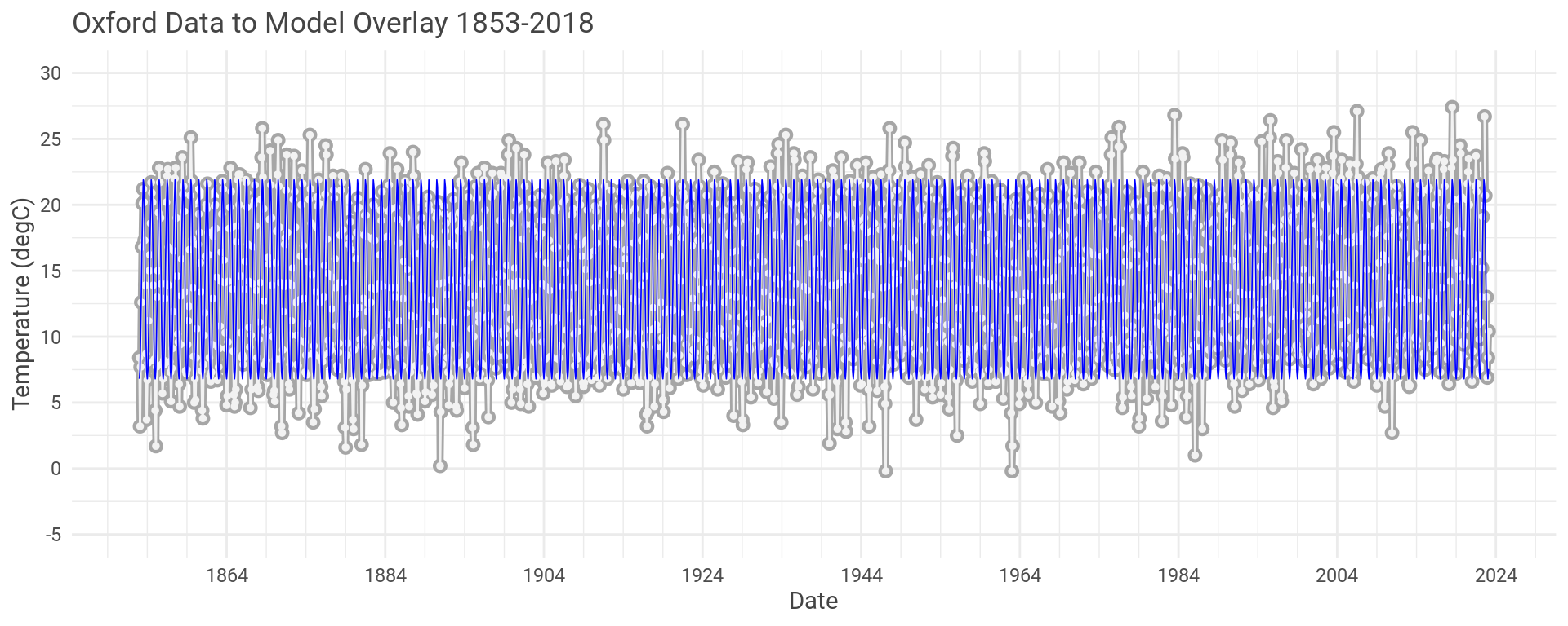
To start we’ll look at the maximum monthly temperature over the whole history for the Oxford data set.
Let’s also throw a linear model across the data in a vain attempt to see what’s going on.
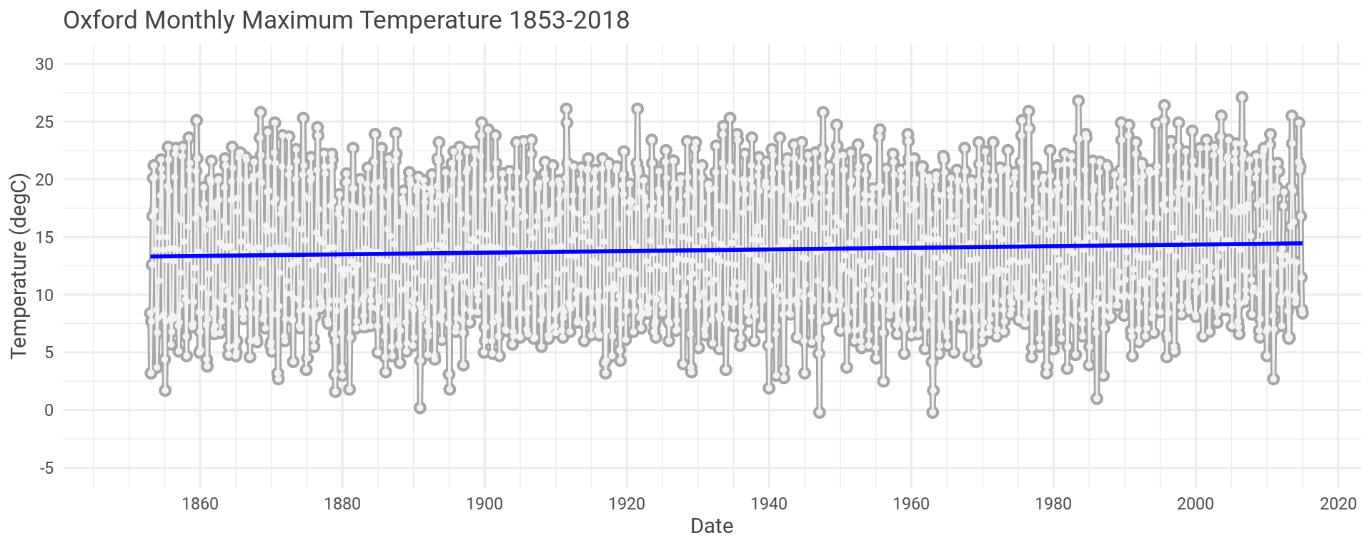
Looks like there is a slight increase in temperature but hard to see what is going on with all the other variation here.
Let’s take a closer look. Same data but just for the first ten years.
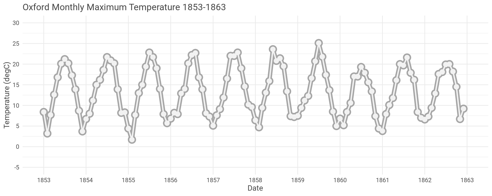
We clearly see the temperature varying with the seasons, due to the Earth’s tilt.
Let’s model this repeating seasonal pattern to get a better idea about what is going on.
Using a linear model, we can model the temperature variation over the course of each single year rather than over multiple years to try and capture the seasonal pattern.
Once we’ve made the model let’s take the model’s predictions and the residual errors, and add them to our data set.
For those that don’t know, predictions are… …predictions and residuals are the difference between the real data and the model’s predictions, or the error in the model.
OK, so let’s look at the model and the actual data for the first and last ten years of the Oxford data set.
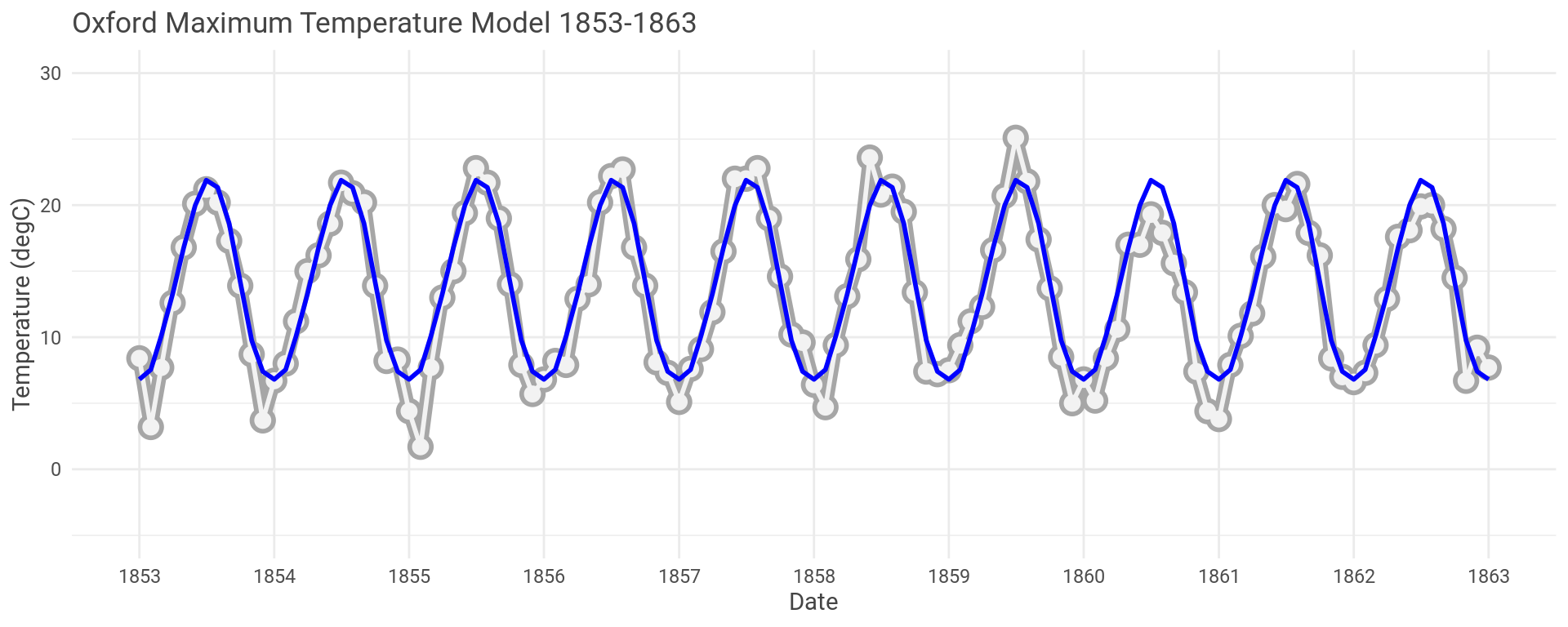
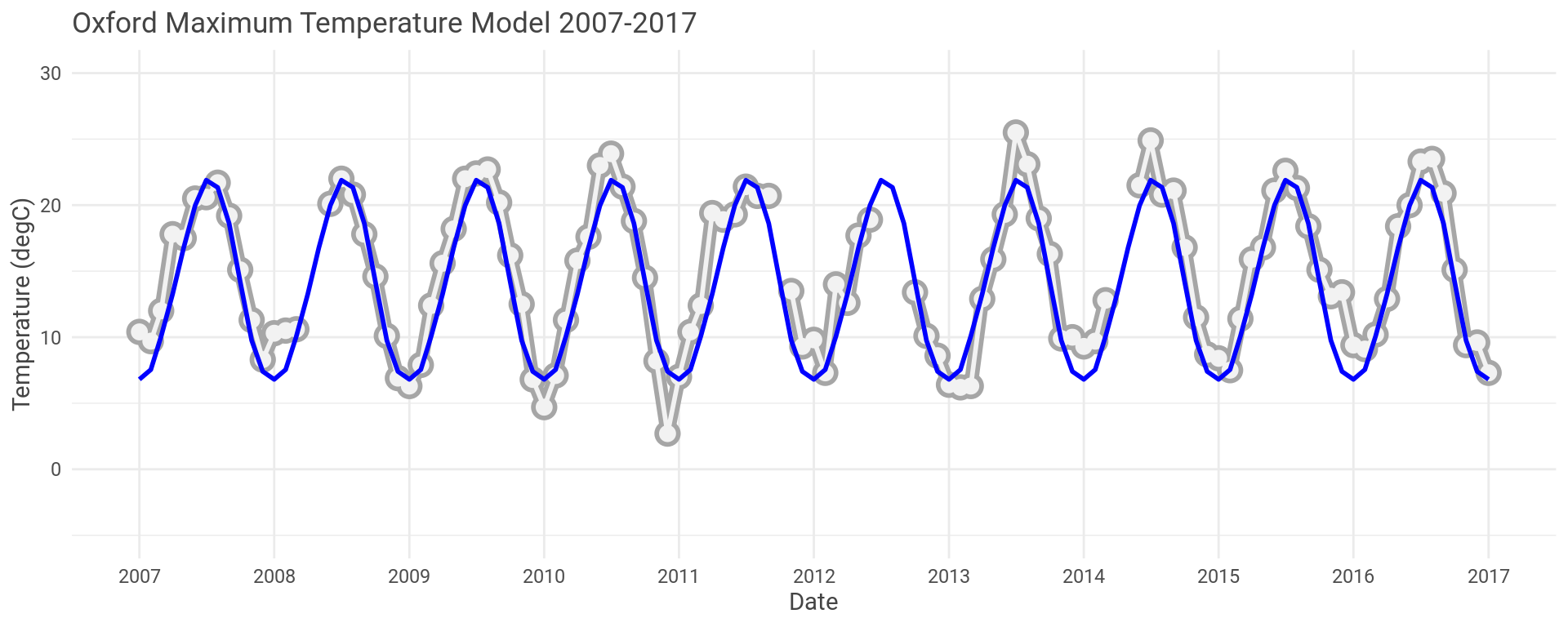
The model looks to have captured the seasonal fluctuations well here.
As an example, the model for the Oxford maximum temperature data has an \(R^{2}\) of 0.904 and a mean p-value of 1.4610^{-7}, averaged over each month.
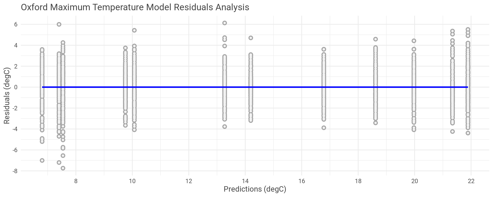
You can see the model sometimes over predicts and sometimes under predicts.
Which is true for the whole data set.
Plotting the model’s residual errors against the predictions we can see where the errors are in the temperature range and check the spread of the errors.
Putting a linear model on this plot lets us see that there is an even distribution of residual errors both positive and negative and that this puts the new linear model lays right along y equal to zero. If we had some other trend here then this would indicate that the model is a poor fit, which isn’t the case.
This process can also be repeated for the minumim monthly temperatures and across all of the remaining weather stations.
Results
Right, we’ve messed around making models, establishing that they are a sound fit and the predictions look fine, now to use it for something useful.
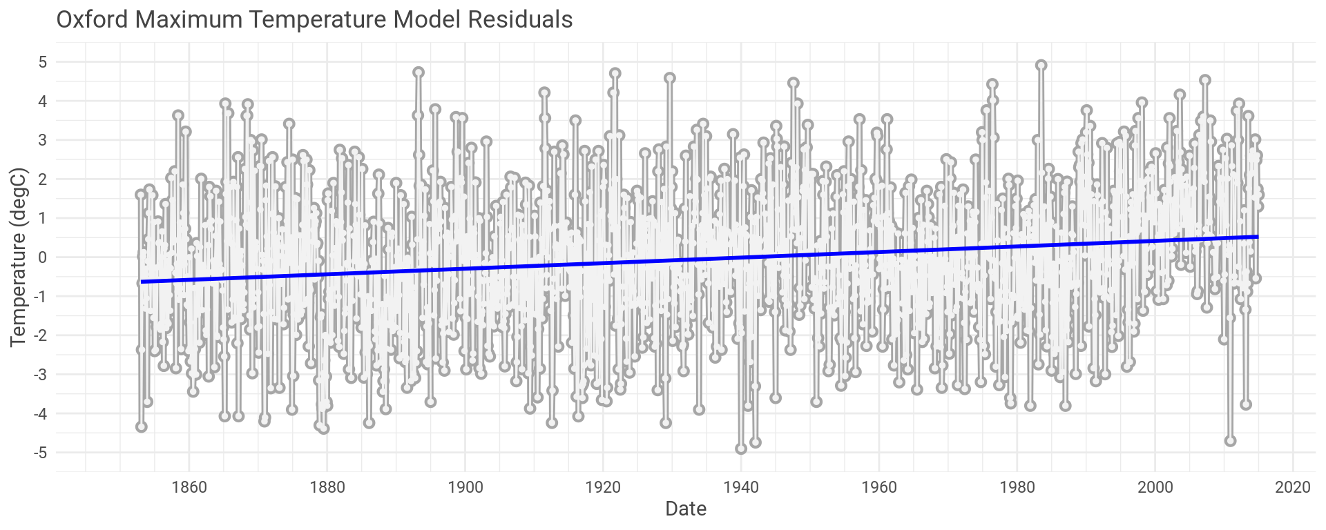
If the model is a good representation of the temperature fluctuation due to the seasons changing, then the error in the models (residuals) should portray temperature change due to anything the models failed to capture.
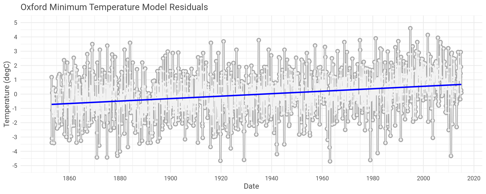
Let’s plot the residual error for the Oxford maximum temperature model we’ve been using as our example.
We can do exactly the same process but looking at the minimum monthly temperatures recorded in Oxford.
Oxford might be an exception though. We could look at the same plots for all thirty seven other weather stations.
This would result in seventy four plots, which is all well and good but it’s a lot of weather stations and a lot of data.
Not exactly easy to take in, bork.
It might make more sense to take the mean data across all the months for each year, average out the maximum and minimum temperature and combine all the weather stations to build up a picture of the UK overall. I’ve shaded the first and second World Wars on the plot, more for an easy time reference than anything else.
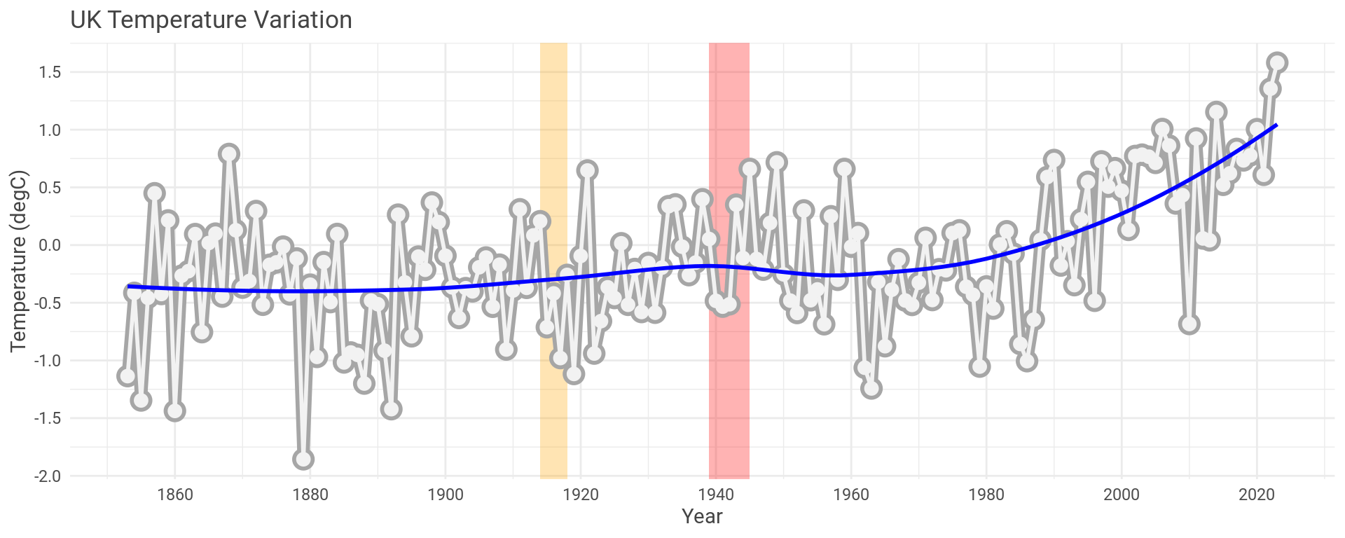
How does this compare with NASA’s global data that prompted this whole mess in the first place?
Well, let’s overlay it and see (red trace).
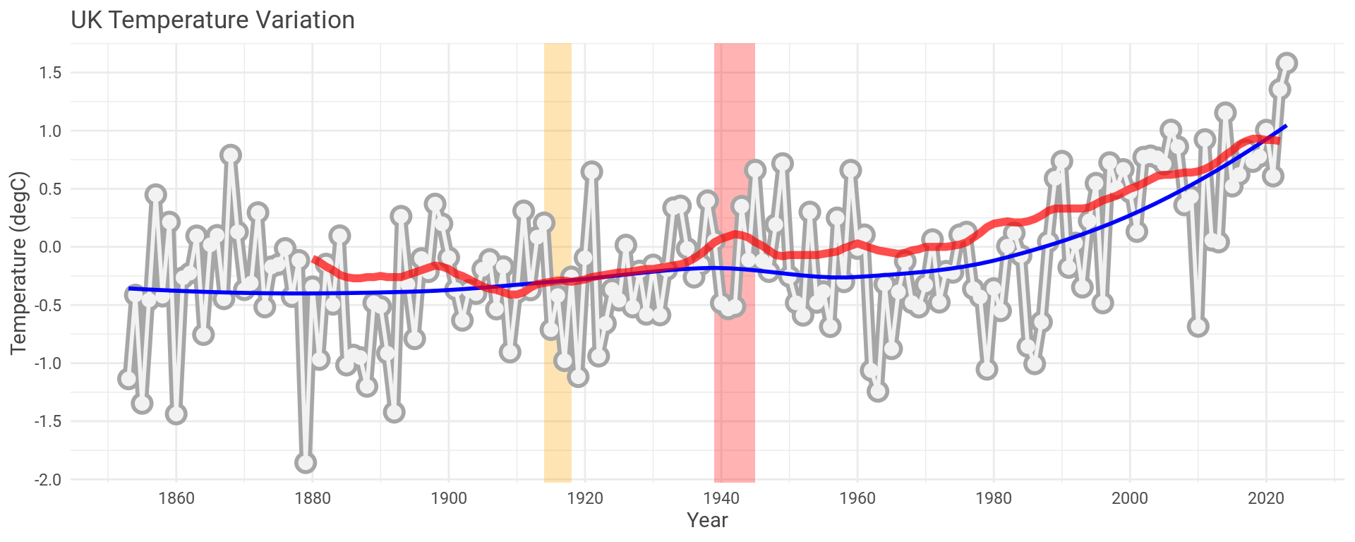
Pretty close, even with only the data for the UK.
Wrap Up
We always hear about global warming in the news but not many people have the time or inclination to go and look at the data for themselves. I set out to see how we might see what is happening with climate change here in the UK. Using some simple modeling practices it is possible to draw similar conclusion to what NASA report, who are using more data and, I’m sure, more advanced modeling techniques.
Hey you!
Found this useful or interesting?
Consider donating to support.
Any question, comments, corrections or suggestions?
Reach out on the social links below through the buttons.